 Written by Taylor London
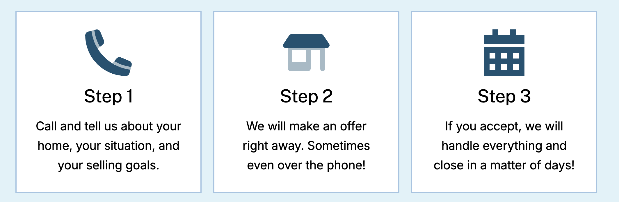
The Icon Block gives you access to thousands of professional icons from Font Awesome Pro — sized, colored, linked, and styled to match your design. Whether you’re building a features section, adding visual anchors to your content, or creating icon-based navigation, this block makes it simple.
Compatibility note: This latest version of the Icon block is available on most Motivated Seller sites published after November 2025 and all other lead types published after February 6, 2026. Not sure which applies to your site? Check here
Learn How To:
- Add an icon to your page
- Swap icons
- Choose different styles for an icon
- Set icon styles for your entire site
- Copy+paste icon styles
- Align icons
- Add links to icons
- Change icon colors
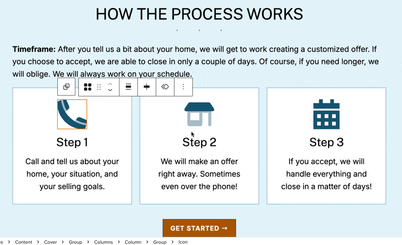
Adding an Icon to Your Page
[RECOMMENDED SCREENSHOT: Icon block in the inserter with search field highlighted]
- Open the Page Editor and click the + button to open the block inserter
- Search for “icon” or scroll to find the Icon block
- Click to add it to your page
- Click Browse Icons to open the icon library modal
The icon browser includes thousands of icons organized by category. You can search by name (like “phone” or “house”) or filter by category to browse related icons.
Once you’ve found the icon you want, click it to insert it into your block.
Swapping Icons
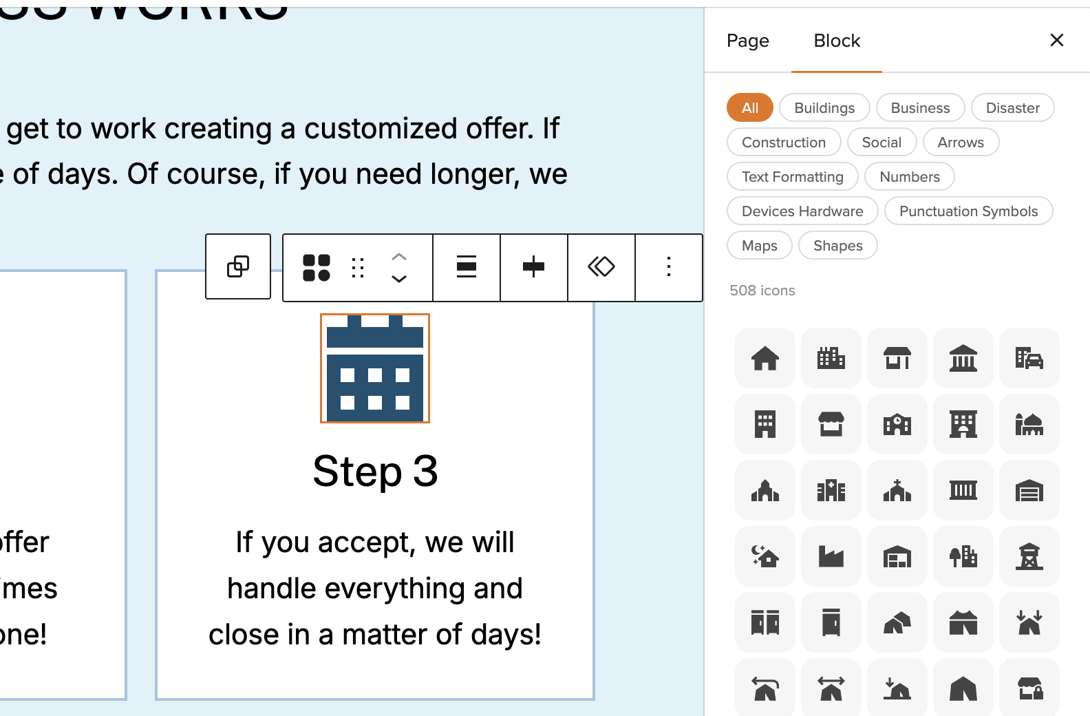
Need to change an icon after you’ve added it? You have two options:
- Click the icon once in the editor to reopen the icon library
- Use the Replace Icon button in the block toolbar above the block
Either method lets you search for and select a new icon without losing your formatting.
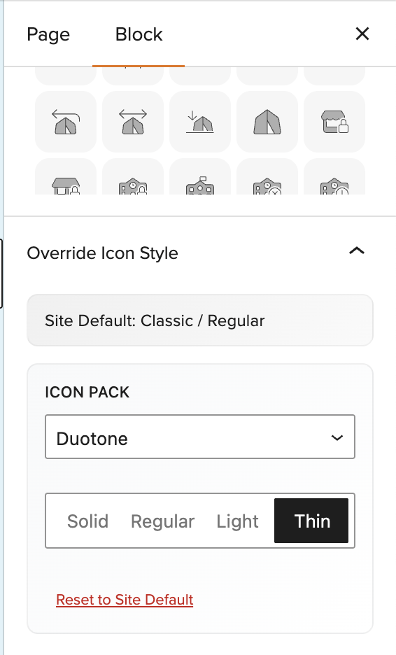
Choosing Icon Styles
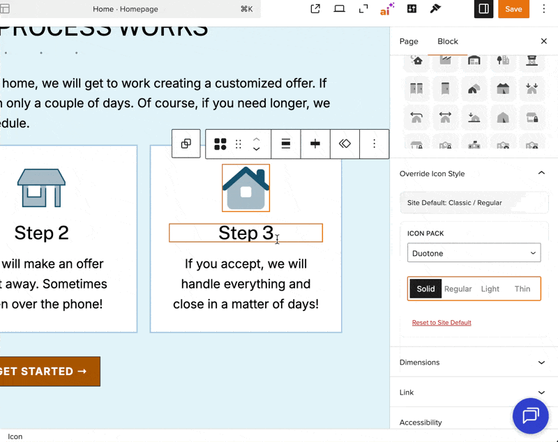
Each icon is available in four visual weights:
- Solid — filled, bold appearance
- Regular — medium weight with more open spacing
- Light — thinner lines, more delicate look
- Thin — minimalist, ultra-thin strokes
You can also switch between design families:
- Classic — traditional Font Awesome icon design
- Sharp — angular, modern aesthetic with sharper edges
- Duotone — two-tone color styling for depth
- Sharp Duotone — combines sharp edges with duotone coloring
To change the style:
- Select the Icon block
- Open the settings panel on the right side of the editor
- Under Override Icon Style, choose your preferred pack and style
- The icon updates instantly in the editor
If you’ve overridden the style and want to return to your site’s default, click Reset to Site Default.
Setting a Site-Wide Default Style
Instead of styling each icon individually, you can set a default style that applies to every Icon block on your site. Any block that hasn’t been manually overridden will update automatically when you change this setting.
To set your site-wide default, you can jump straight to the setting in your Site Editor here.
OR…
- From your dashboard or the top toolbar, click Design
- Click Styles, then select Blocks
- Search for icon block
- Choose your default pack and style
Global style changes take effect site-wide, so this is the most efficient way to keep icons consistent across multiple pages.
Copying Styles Between Icons
Once you’ve dialed in the look of one icon — size, color, spacing, borders — you can copy that styling to any other Icon block:
- Select the styled icon
- Click the three-dot menu in the toolbar
- Choose Copy styles
- Select another Icon block
- Click its three-dot menu and choose Paste styles (You can also use the Ctrl+C/Ctrl+P shortcut here)
The icon itself doesn’t change — only the formatting carries over. This is especially useful when building a row or grid of icons in a section. Style one, paste to the rest.
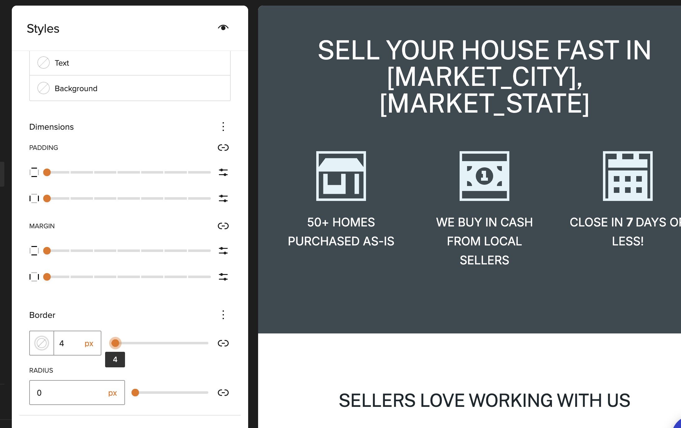
Sizing Your Icons
Icon dimensions default to 48px × 48px and maintain their proportions automatically.
You can customize the size in the settings panel:
- Width and Height controls let you set exact pixel dimensions
- The lock icon between them keeps proportions linked (recommended for most cases)
- Click the lock to unlink dimensions if you need non-square icons
Aligning Icons
Use the alignment buttons in the block toolbar to position your icon:
- Left — aligns to the left edge of its container
- Center — centers horizontally
- Right — aligns to the right edge
This is especially useful when building icon grids or positioning icons alongside text.
Adding Links to Icons
Icons can function as clickable links — perfect for phone numbers, email addresses, or social media profiles.
To add a link:
- Select the Icon block
- In the settings panel, find the Link section
- Enter your URL in the Link field
- Check Open in new tab if you want the link to open in a new window
- Optionally add rel attributes for SEO (like
nofollowfor external links)
Styling with Color
Icons support full color customization through the standard Carrot color controls:
- Text color — changes the icon itself
- Background color — adds a colored background behind the icon
Access these in the settings panel under the Color section. You can choose from your theme’s preset colors or use the color picker for custom values.
Adding Borders
The Icon block includes complete border styling options:
- Border color — choose any color for the border
- Border radius — create rounded corners (try 50% for circles)
- Border style — solid, dashed, or dotted
- Border width — control thickness on all sides or individually
These controls are in the settings panel under the Border section.
Spacing Controls
Adjust margin and padding using the standard block spacing controls in the settings panel. This lets you:
- Add breathing room around icons in a grid
- Control spacing between an icon and surrounding content
- Fine-tune alignment with adjacent blocks
Accessibility Labels
If your icon carries meaning on its own (like a phone icon used without accompanying text), add an accessibility label so screen readers can describe it to visually impaired users.
To add a label:
- Select the Icon block
- In the settings panel, find the Accessibility section
- Enter a descriptive label (e.g., “Call us” for a phone icon)
Icons without labels are automatically hidden from screen readers (aria-hidden="true"), which is appropriate when icons are purely decorative or paired with text.
Tips for Using Icons Effectively
Use icons to break up text-heavy sections
Icons give readers visual anchors and make content easier to scan.
Keep your style consistent
Mixing too many icon weights or families can look disjointed. Pick one combination and stick with it across your site.
Size icons appropriately for their context
Smaller icons (24-32px) work well inline with text, while larger icons (48-64px+) are better for feature sections or hero areas.
Don’t overuse links
Not every icon needs to be clickable. Reserve links for icons that represent clear actions (phone, email, directions).
Learn More
- Carrot Editor: Overview of New Blocks and Design Features
- Carrot Editor: Site Logo, Site Title, and Site Identity Blocks
- Blocks: Explained
- How to Create Block Patterns
New to Carrot?
Welcome!

Here’s our full guide for what to do when getting started with your Carrot website:
Want Us to do Some
Editing for You?
You are busy doing what you do best, running your business. Leave the site work in Carrot’s hands.