A full-width image and text overlay can really help alleviate eye strain on readers and help you draw attention to a piece of content. To achieve a full-width layout, you’ll want to use the cover block. Cover blocks allow you to use an image or a single color to break up your content. You can then add some simple text and a heading to the image. Here’s an example of what that can look like:

Let’s get started!
Step 1: Go to your page list and click the title of the page you want to edit
Step 2: Add a Cover Block where you want the full-width image to be
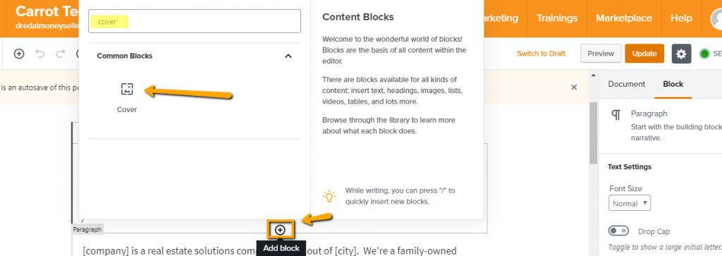
Hover your mouse over the page and find the circle button to “add block.” Click this to open the block choices.

Step 3: Select Cover Block
The easiest and fastest way to find your block is to start typing in the search bar above the choices. Cover blocks are in the Common Blocks category. As soon as you see it, click the option to add the block where you selected.
Step 4: Upload a Photo or Choose a Background Color
Background color choices are an array of the black & white scale with the color choices coming from your site’s branding colors, set within design. If you want to use different colors, you’ll want to choose those within your site’s design. Learn how to update your brand colors here.
Photos should be a .jpg or .png format with a minimum width of 1920 pixels so they do not stretch on computers.

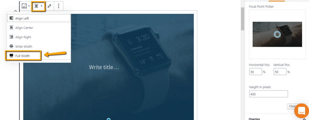
Step 5: Set Alignment to Full-Width *optional*
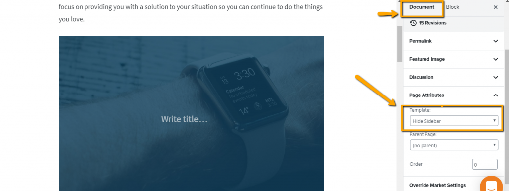
If you have a sidebar, and want the image or background to stretch across the entire screen, then you will want to hide the sidebar first. If you want to keep the sidebar, you can skip to step 6. If you prefer to have a full-width cover block, please do the following.
Set the document settings to “hide sidebar”
Align the cover block to full-width
Step 6: Add Content to Your Cover Block

Step 7: Select Preferred Content Block *optional*
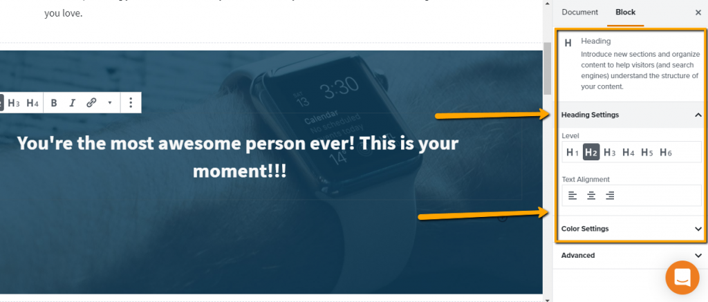
If you prefer to have a heading, list, or quote block, you’ll want to transform the paragraph block. Select the backward “P” on the top menu and choose the block you want to use instead of a paragraph block.

Step 8: Update Content Block Settings on the Right
Typical Features & Styles include:
- Text Settings – these settings apply to all content within the block
- Font sizes – (small, normal, large, larger)
- Drop Cap toggle is a massive first letter indented with normal text following
- Color Settings – Black, grey, white, and your branding colors are available
- Background color of the block
- Text color of all the text in the block
- Learn how to update colors here
- Advanced Settings – developers use this for custom markup (code)
Step 9: Click Update and You’re Done

New to Carrot?
Welcome!

Here’s our full guide for what to do when getting started with your Carrot website:
Want Us to do Some
Editing for You?

You are busy doing what you do best, running your business. Leave the site work in Carrot’s hands.

