 Written by ryanchristian
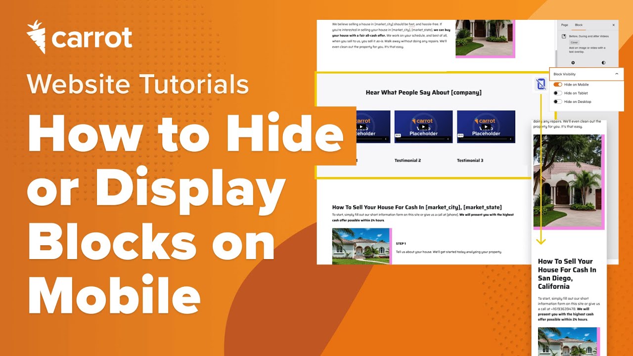
 Have you ever wanted to hide specific content on mobile devices that you want to display on desktop, or vice versa?
For example, maybe you have an image that you want to hide on mobile devices to lessen the amount of scrolling visitors have to do on mobile. Or maybe you want to format a section of your homepage differently on desktop because it looks better. Well, now you can!
As of July 2025, we implemented a new block level setting for container blocks (like Group and Row) that allows you to show or hide blocks when viewed on mobile, tablet or desktop! That way, you have more control to create a clean, conversion optimized design across all devices. This was previously only possible by using custom CSS.
In this guide, we’ll dive into which blocks have this capability as well as how you can enable it.
Check out the demo video below or keep reading to learn more. Let’s dive in!
Available Blocks and Settings
As mentioned above, this new block visibility setting is only present on container blocks. Container blocks are blocks that are meant to format and house (contain) other block types. Here’s a list of all the available container blocks:
- Columns
- Group
- Row
- Stack
- Grid
- Image
- Cover
On the blocks listed above, you’ll now find a “Block Visibility” section in the settings pane on the right of the editor. In that section you’ll find three toggles, all of which can be enabled in any fashion:
- Hide on Desktop: This will hide the block on screen sizes 1024px and above
- Hide on Tablet: This will hide the block on screen sizes from 670px to 1023px
- Hide on Mobile: This will hide the block on screen sizes below 670px
Any combination of the three settings above can be set, that way you can ensure a block only displays on desktop, or tablet and mobile, or any other combination!
Next up, we’ll dive into where to find it and how to use it!
How to Use Block Visiblity
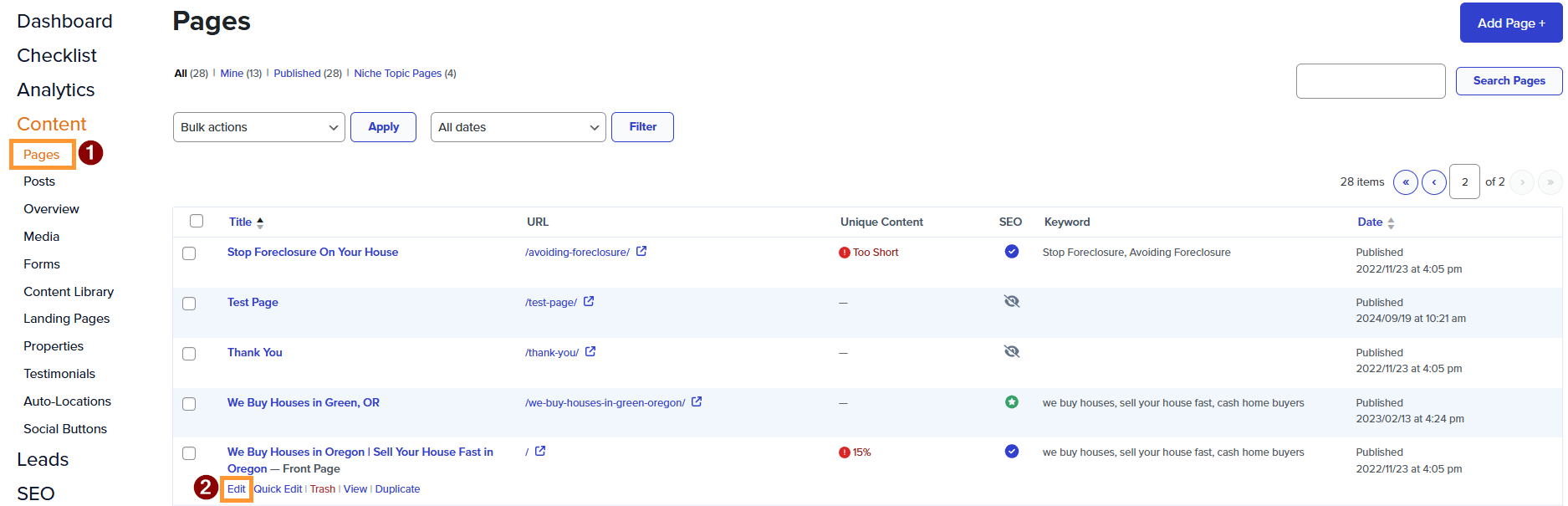
Step 1: Edit a Page
In your site dashboard, navigate to your page list and click on a page you want to edit.
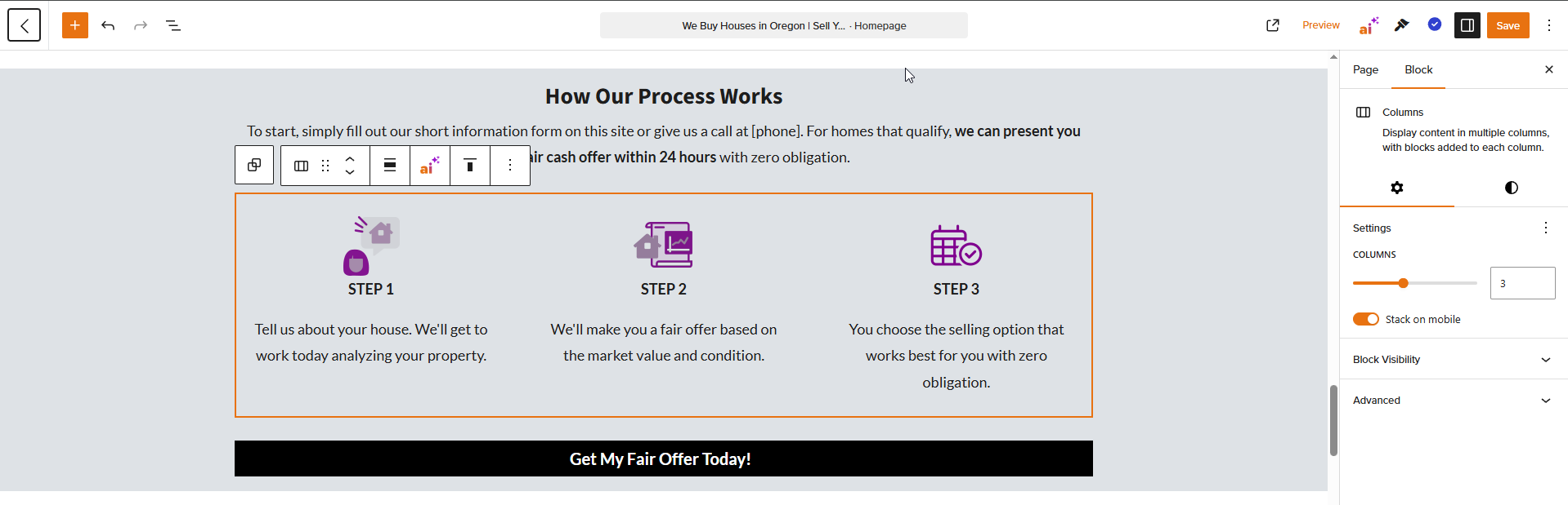
Step 2: In the Editor, Select a Container Block
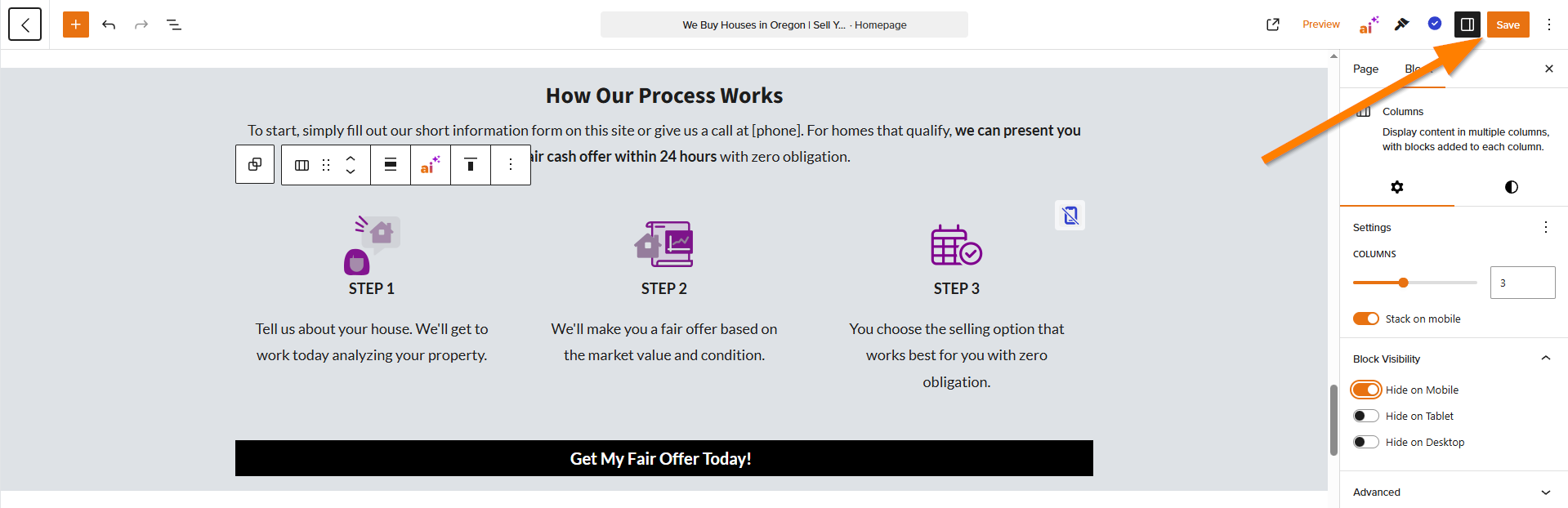
Once you’re in the page editor, find and click on a container block. If you need a refresher on which block is a container block, please refer to the list above. In this example, we’ll be using a columns block that contains our process steps.
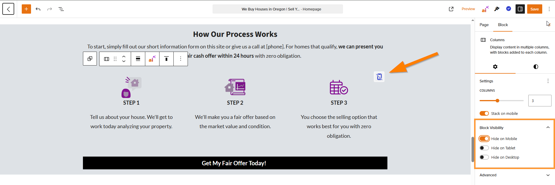
Step 3: Set the Block Visibility
In the settings on the right, expand the Block Visibility section and set it to your liking. You should see a corresponding icon appear in the top right corner of the block to indicate which device it is being hidden on.
Step 4: Save
That’s it! Go ahead and save your page in the top right corner of the editor.
Conclusion
Voila! You’ve now hidden a block on a device of your choosing. This is a really powerful tool to leverage even more customization across all devices. Giving you more control to create conversion-optimized designs, especially with the increase in mobile traffic.
To learn more about using the visual editor and customizing your site, please check out the guides below!
Learn More
Close More Deals
with Carrot CRM
Grow your revenue and turn more leads into closed
deals with Carrot’s built-in CRM.
Premium Support
& 1:1 Strategy Calls

Members with our Premium Support Add-On can book
a 1:1 video calls for tech questions & strategic advice.