Overview
The primary job of review/testimonials is to eliminate objections and reduce resistance for your potential leads so that they feel the right path to solving their problem is to work with you. Most people use testimonials and reviews on their site as a space filler. They feel their job is to get them on the site, and the more, the merrier.
Yes, more is better here. But it’s better to prioritize having ten amazing reviews specifically curated to eliminate the top 4 objections you need to solve before someone will work with you… vs. 100 reviews formatted badly, with no focus, where most say, “working with Bob was great.”
To ensure you have a high converting Reviews page, you’ll want to include the following:
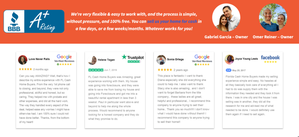
- A mix of reviews from different sources (Google, BBB, Facebook, etc.)
- Well-formatted testimonials (more on that below)
- A paragraph at the bottom of the paging summing everything up & ending with a personal note
Keyword target: "[company name] reviews"Formatting Testimonials
The format of a testimonial is critical in making the testimonial effectively relay the information and eliminate the objection.
From most effective to least effective, here is what to include in a testimonial. These elements help to increase the believability, trust, and credibility of the company. Testimonials formatted incorrectly can actually decrease trust more than not having the testimonial on the site at all.
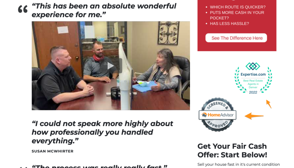
✅ Candid/real images/videos increase believability.
Always aim to include a photo or video when possible in as many testimonials on the site as possible. Candid, real photos that are not professionally shot are best.
✅ Benefit/objection-focused headline and testimonial text to stop the scroll on the site.
Most testimonials are weak and say, “It was great working with Mark! He was responsive and a pleasure to work with”. This is great only to make the person comfortable they aren’t an ax murderer. But it won’t help eliminate the objections stopping them from doing business with them. When we don’t have a headline over a video or testimonial that stands out, people will scroll by it and never click the video. Compelling headlines over testimonials are key to getting people to stop and engage.
✅ Details on who the person in the testimonial is.
This helps the person reading the site relate to the person in the testimonial and increases the believability of the testimonial.
✅ Believability over aesthetic.
If the testimonial was sent through a 3rd party platform like Google Reviews, a Facebook post, BBB review, an email or text the client sent, screenshot these and use them as the testimonial. More often than not, these perform better than putting the testimonial into a pretty design. Screenshots from trusted platforms tell the site visitor, “this is real and isn’t made up.” We become skeptical of testimonials in pretty graphics because we could have made all or part of it up, and it plants that seed of skepticism in the mind of the prospect.
The more of these elements mixed into the testimonial, the more effective it’ll be in increasing performance on the website. A good mix of testimonials with different levels of info and formatting is ideal. Some videos, some pictures, some 3rd party screenshots, etc. The more variation, the more believability. The more they all look the same, the less believability.
Examples
Testimonial Quality = Best
- Video
- Benefit/objection-focused headline
- Client name & details
- Bonus points if the review was submitted through a 3rd party platform or via text/email.

Testimonial Quality = Better
- Photo of the client
- Benefit/objection-focused headline
- A detailed, written testimonial that eliminates top objections
- Client name & details
- Bonus points if the review was submitted through a 3rd party platform or via text/email.

Testimonial Quality = Good
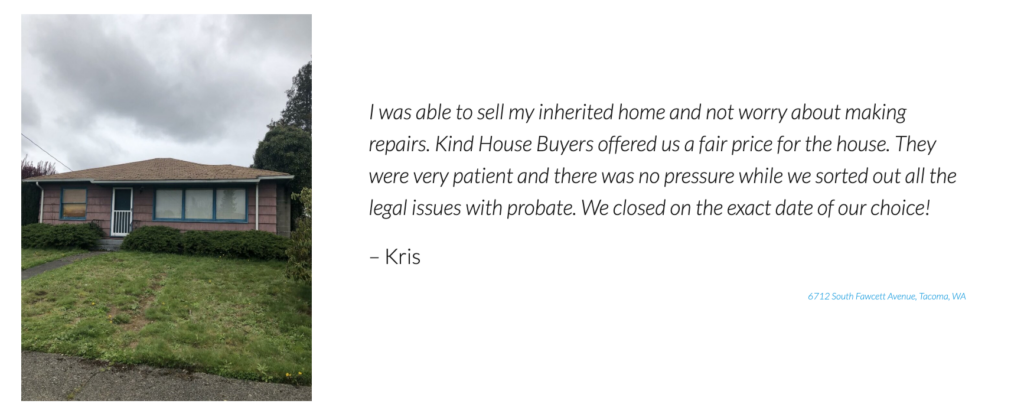
- Image of the house
- Benefit/objection-focused headline
- Client name & details

Testimonial Quality = Below Average
- Written testimonial or video with no headline
- Client name & details

Testimonial Quality = Not Good
- Written testimonial with no headline
- No client details

ℹ️ Examples of well-formatted Reviews pages:
ℹ️ Learn more about adding testimonials with these tutorials:


