 Written by Mallory Whitfield
 Introduction
With Carrot’s Visual Editor and Blocks, you’ll have endless options to customize your website’s pages and make them your own. This is one of the best ways to differentiate your site’s design!
In this tutorial, you’ll learn different options for adding a block, how to use block settings and page-wide settings to personalize your pages, and how to remove or change a block.
Check out the video below, or keep reading to learn more:

Step 1: Add a Block
There are multiple ways to add a block and choose the block type you need.
The default block is a Paragraph block — which you’ll use for regular text — but you can choose a different block type from any of the ➕ buttons. You can also search blocks by typing in the block name.
Option 1:
Click ➕ at the right of any empty block:
Option 2:
Click ➕ at the top left of the visual editor toolbar at the top of your screen:
Option 3:
Hit the Enter/Return key from a selected block to create a new block below it. Then type / to choose a block to add:
Option 4:
Hover your mouse between two existing blocks, then click the ➕ that appears at the center to add a new block:
We recommend option 4 when editing an existing page because it will insert it exactly where you want the block, without you having to move the block up or down to your desired placement.
Option 5:
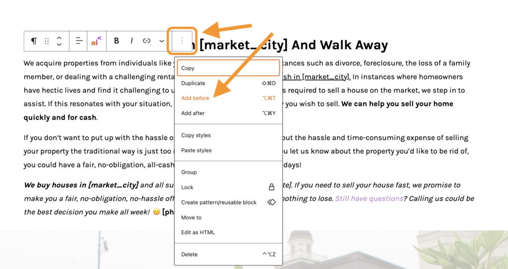
Click an existing block. On the toolbar that appears, click on the three dots at the right side of the toolbar. Select “Add before” or “Add After” to add a block above or below the current block:
Step 2: Using Block Settings
Most blocks have their own settings you can use to personalize that area of your site. This includes options to move the block, change text formatting and alignment, add a link, and more.
There are two settings areas for most blocks:
- Block Settings – Toolbar
- Block Settings – Sidebar
Please note, there are blocks that do not have additional settings, such as the shortcode block.
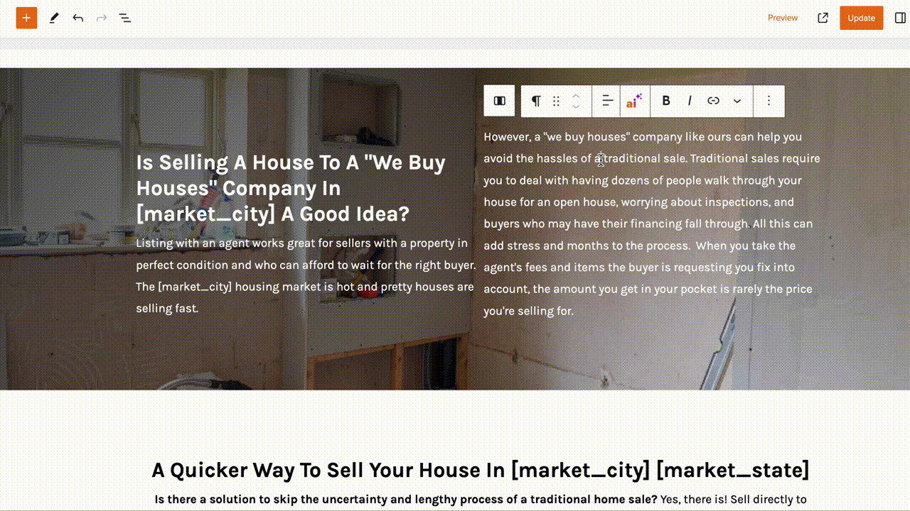
Block Settings – Toolbar
To access a block’s toolbar, you’ll need to click the block and a toolbar will appear above the block with icons. These icons represent available settings within that block.
For instance, if you click a Paragraph block, you’ll see a Paragraph toolbar with different options for formatting your text:
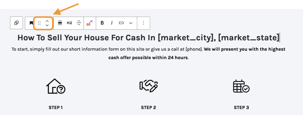
Within the block toolbar, you’ll also find options to move your blocks around on your page.
You can drag blocks around by clicking and holding the six-dot-grid near the top-left corner of each block toolbar, or use the up and down arrows to move a block one spot in the direction you want:
Click on the three dots at the right of the block toolbar for additional options:
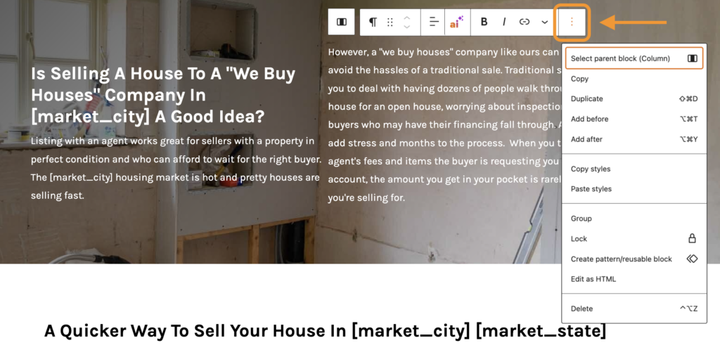
Some of the options commonly found here include:
- Duplicate creates a second block on the same page with the same content
- Add before/after adds a new block before or after the current block
- Group allows you to gather blocks together and have multiple blocks nested inside of other blocks
- Create pattern/reusable blocks allows you to create a block pattern that can be used on other pages that retains the exact content and styling of the block. Learn more
- Edit as HTML switches the block to the HTML version of it so you can edit the HTML directly. When editing as HTML, this option changes to Edit Visually.
- Delete removes the block from your page/post
Block Settings – Sidebar
Additional block settings can be found in the sidebar to the right of the editor. If you don’t see the sidebar, you may need to toggle it on by clicking the sidebar settings icon in the top right corner of your screen:
The Block settings in your editor’s sidebar will provide different options based on what block you’re using. These are typically related to styling, sizing, and colors.
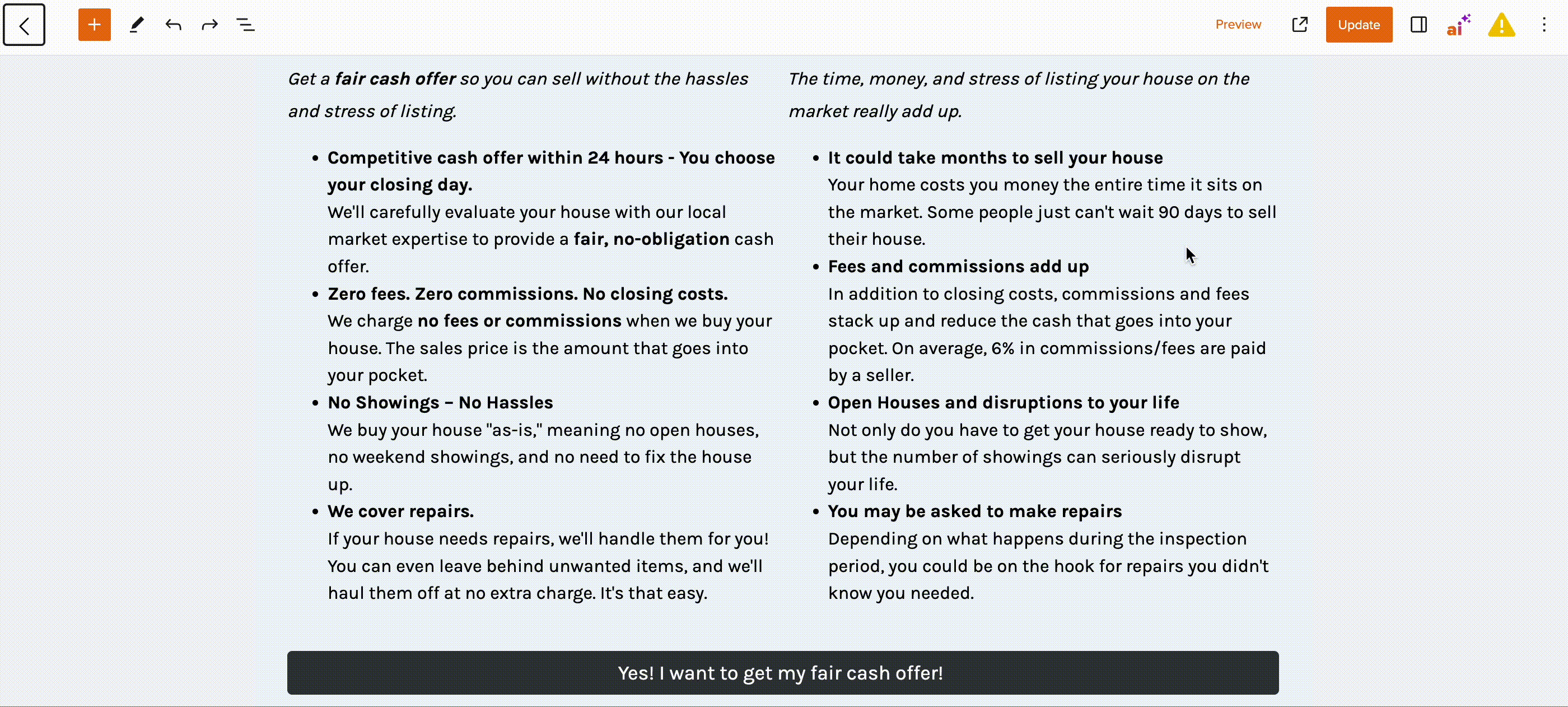
In the screenshot below, the active block is a Paragraph, so there are options for changing the styling of the font, plus color settings that give you the option to change background colors and/or text colors:
You’ll see whites, grays, blacks, and your main brand colors in your color selection settings. The brand colors are automatically taken from your site’s design settings and include a light and dark variation of your site’s primary, button, and link colors. Find out how to update your site’s brand colors using this tutorial.
We encourage you to explore all the different options and settings for each block. This is one of the best ways to differentiate your site’s design and make it your own!
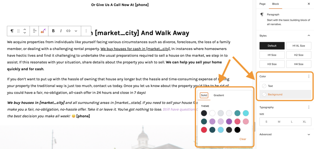
For example, when editing a List block, you can use the sidebar settings to change the style of your bulleted or numbered list to Checkmarks or Large Numbers:
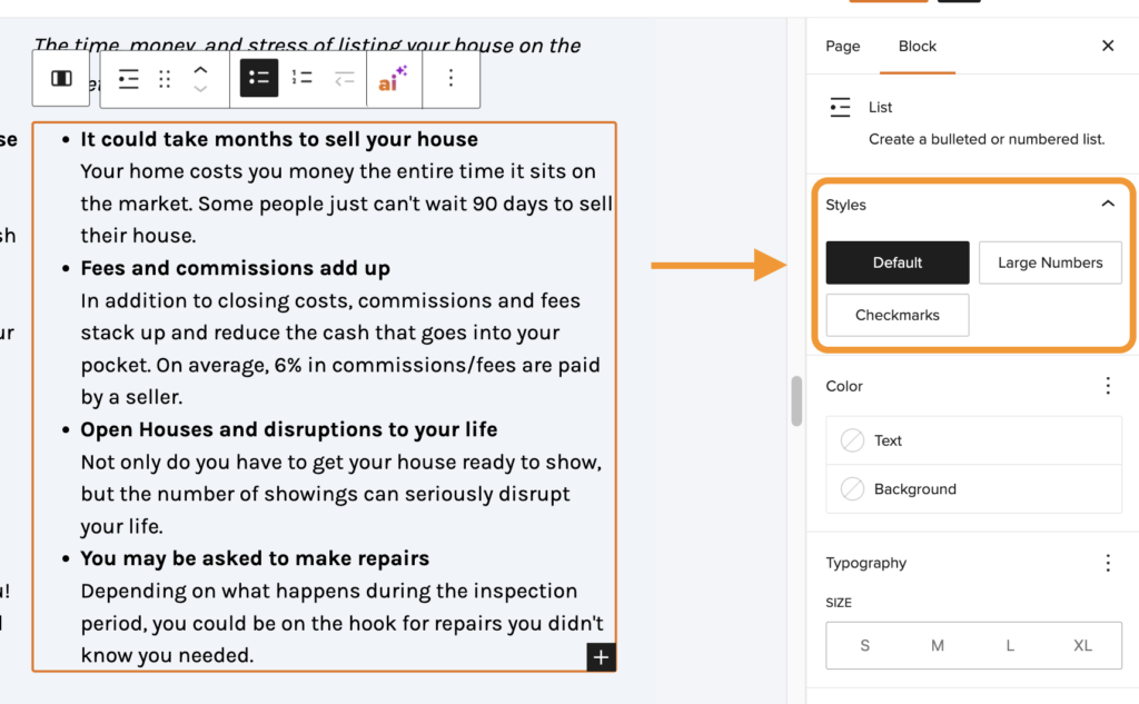
Or when editing an Image block, you can change the style from Default to Rounded, Grayscale, or Shadowed:
Position, Dimensions and Border
As of 2025, you now have the ability to customize position, dimensions and border with select blocks in the Carrot editor. These settings allow for greater customization with certain elements to enable you to create high converting designs.
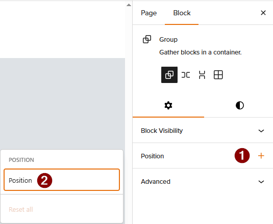
Position will only be available on Group Blocks. This setting will allow you to set a group block (and its contents) to Sticky. Setting the position to sticky will allow that group and its content to stick to the top of the window instead of scrolling with the rest of the page.
- To enable this, click on a group block in the editor and then click “Position” in the block settings on the right sidebar.
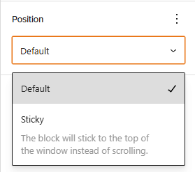
- From there, click “Position” again from the flyout and use the dropdown to select “Sticky“.
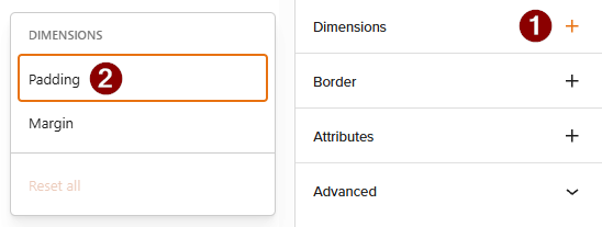
Dimensions and Border will be available on text blocks, such as heading and paragraph blocks. These will allow you to set Margin and Padding, and Border and Border Radius respectively.
- To customize these, click on a text block and then select “Dimension” or “Border” in the right sidebar settings.
- From there, select which one you want to customize (Margin vs Padding, or Border vs Border Radius), then start setting the values how you like.
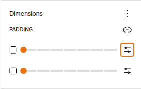
You can use the slider to adjust these values or use the button on the right to type in specific values!
Advanced
At the bottom of the sidebar block settings, you’ll find the Advanced section. You will see this in all blocks:
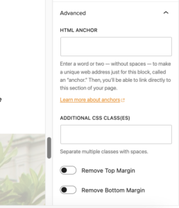
This section is reserved for adding “anchors” (jump links) and additional CSS classes. It is best used by someone with coding knowledge. You can also disable top and bottom margins for most blocks.
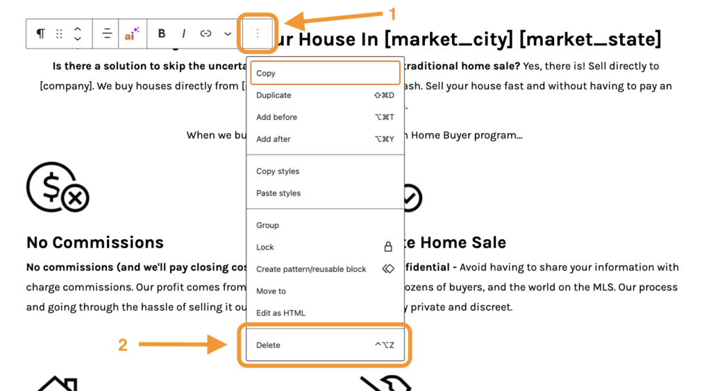
Step 3: Removing or Changing a Block
To remove a block, select the block and click the three dots at the right of the toolbar above it. The last option in the drop-down is to Delete that block:
Changing a Block Type
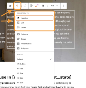
What if you’d like to change a block type? No problem: you can transform each block to another similar or related block type.
In the block’s toolbar, simply click the block’s icon at the left side of the toolbar. The icon indicates the block type, and it will be different depending on what type of block you’ve selected. Once you click the icon, you’ll see options to transform the block to similar types of blocks.
For example, change a Paragraph block to a Heading, List, or Quote block:
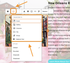
You’ll find different options to transform an Image block into a Cover, Gallery, Columns, File, or Media & Text block:
Step 4: Adjust Page or Post Settings
Finally, before publishing a new page or making significant changes to a page or blog post, you’ll want to check your Page or Post settings — these are options that apply to the page or post as a whole.
In the sidebar next to the Block settings, you’ll find either Page or Post settings (depending on whether the type of content you are editing is a Page or a blog Post).
If you don’t see the sidebar, you may need to toggle it on by clicking the sidebar settings icon (the black square in the screenshot below) in the top right corner of your screen.
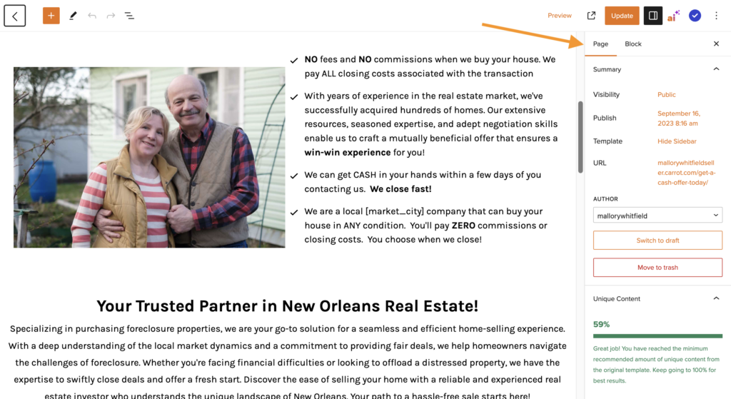
This is where you can change the URL of your post or page, choose a featured image, see and change the status of your post, add tags and categories, and more.
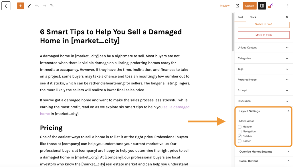
You’ll also find Layout Settings here, which is where you can hide or show certain parts of your site, like your Sidebar or Footer:
Here’s an overview of all the options you’ll find in your Page or Post settings sidebar:
- Visibility – choose to make the page public, private, password protected or draft
- URL – updates the link of your page. This is usually what follows the “/”
- Unique Content – Carrot’s Unique Content Tool shows you how much your content differs from the standard template. You’ll want to make each page or post uniquely your own for optimal SEO benefits. Learn more
- Categories – (posts only) sets a category for your posts to be organized by a keyword
- Tags – (posts only) sets a tag for your posts to be organized by tags
- Featured Image – is the image seen when the page/post is shared on social media
- Excerpt – (posts only) allows you to choose the excerpt shown on your posts (/blog) feed
- Discussion – sets a comment box at the bottom of the page/post
- Layout Settings – use this to hide or show the header, navigation menu, sidebar or footer on a specific page or post
- Page Attributes – can set parent pages
- Override Market Settings – can set an override for your market state, city, zip code, and phone number on a single page
- Social Buttons – hides the social media sharing buttons on the page/post
Conclusion
Congrats! Now you should know how to add or remove a block and how to use the different settings options to personalize your content.
We encourage you to continue to explore the different blocks and their settings to customize your site.
Now that you understand the basics of how to use the Visual Editor and Blocks to customize your pages, take it even further!
Check out our tutorial on Creating High Performing Layouts With The Visual Editor to see more examples of how you can use these tools to customize your page.
You can also use our pre-built block patterns or create your own reusable block patterns to make customizing your site a breeze!
Learn More
- Creating High Performing Layouts With The Visual Editor
- Differentiate with Design
- Changing Your Site’s Colors
- Explained: Hero Block
New to Carrot?
Welcome!

Here’s our full guide for what to do when getting started with your Carrot website:
Want Us to do Some
Editing for You?
You are busy doing what you do best, running your business. Leave the site work in Carrot’s hands.