 Written by Ryan Christian
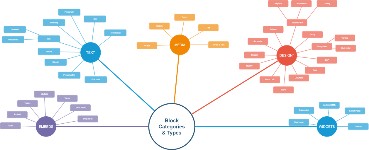
 As you dive into editing your Carrot site, you’ll use the Visual Editor extensively. When you do, you’ll encounter Blocks. Blocks are individual page elements that allow you to build the page piece by piece to achieve the desired format.
This page dives into every available block, what they are for, and how you can use them.
Carrot’s favorite Block types are marked with a 🥕.
In addition to the blocks listed below, we also have many pre-built Block Patterns to speed up your website editing. Learn more about Block Patterns.
ℹ️ If you’re new to Carrot, learn more about how the Visual Editor and Blocks work together to let you customize your pages and design your site.
Jump to*
Text Block Types
Block Type
Definition & Use-case
Best Practices
Paragraph 🥕
This is a default block that houses paragraphs text on your site. It is the most common block type you will use.
Start typing after you click the inserter to use the default Paragraph Block. You can always ‘Transform” the block type if you’d like to use another block type for your paragraph.
Heading 🥕
One of the most prevalent block types, used primarily for titles and section breaks. Headings organize information on your page and introduce the content below them.
The content & hierarchy of headings is very important when considering on-page SEO.
H1 is the most important heading, and each page should have a single H1 heading. H2 and H3 tags are the most commonly used subheadings
Testimonial 🥕
Testimonial blocks display testimonial content and display it in bold, emphasized formatting.
Use this block on any page that you want to emphasize credibility for site visitors.
Click here to learn how to add testimonials and use this block.
Use the quote block to add a quote format for something that isn’t a published testimonial on your site.
Quote
Displays quoted content in an emphasized format.
Use this if you have a quote you want to display that is not a published testimonial on your site.
We recommend using the Testimonial Block if you would like to display your testimonials in emphasized quotes.
List (all)
The List Blocks is content that is displayed in a format that allows you to use a bulleted or numbered format to separate items on separate lines.
Use lists to differentiate related text that would typically be separated by commas. This is a stylistic choice and gives readers a break from reading paragraphs and headers.
Table
Insert a table onto any post or page and easily select the number of rows and columns without having to code them.
Columns are horizontal boxes.
Rows are vertical boxes.
Perfect for sharing charts and tabulated data. See example.
We recommend using the Column Block if you want to have content in columns without being outdated. Tables are specific to data.
Pullquote
Pullquote blocks emphasize a part of your text to make short excerpts look great!
Carrot generally uses the quote block instead of pullquote blocks.
Preformatted
Preformatted Blocks keep all spaces and line breaks intact if you are copying and pasting information from another document.
Use this if you have drafted content in Word, Drive, or another program and want to keep the styling.
Classic
Allows you to use the classic editor circa October 2019. It is similar to word processors, such as Microsoft Word or TextEdit.
We don’t recommend this block unless you are familiar with word processors.
Details
Accordion style block that allows you to hide and show additional text content.
Best used for organizing and displaying multiple content sections (like FAQs or product details) in a compact, collapsible format to improve user experience and page readability without overwhelming the viewer.
Embed Block Types
Block Type
Definition & Use-case
Best Practices
Forms 🥕
Form Blocks are used to insert a form into the content of your page.
Click here to learn how to create and add new forms to your site to use this block.
Properties 🥕
The Properties Block showcases feature properties on your site.
Displaying a feature property, without having someone input information into a form, is a great way to build rapport for a site visitor.
Click here to learn how to add properties and use this block.
Youtube 🥕
Add a Youtube video to your site using the Youtube Block.
Never have your site visitors leave your page to watch a video. Use this block to embed Youtube videos so visitors stay on your site and the video and site can improve content rankings.
Click here to learn how to embed YouTube videos with this block.
Vimeo
Add a Vimeo video to your site using the Vimeo Block.
Never have your site visitors leave your page to watch a video. Use this block to embed Vimeo videos so visitors stay on your site and the video and site can improve content rankings.
Twitter Blocks give you the option to add tweets to your site.
Use these as references within blog posts’ content and share you company page’s tweets to gain more followers and traction on social media.
Embed
The embed block allows you to embed videos, images, tweets, and other content from external sources.
When possible, use a block specifically for your embed needs. If you don’t see one, this is the best option.
Inline Script/iFrame
The Inline Script/iFrame block allows you to embed code in the form of Scripts or iFrames from 3rd party providers.
It’s best to use these for Calendly widgets, Google review carousel widgets, 3D Matterport tours, and any other code with a <script> or <iframe> tag.
Media Block Types
Block Type
Definition & Use-case
Best Practices
Image
Insert a single image on a page or post using the Image Block.
Multiple images are added using a Gallery Block.
A wide or full-width image is best added using the Cover Block.
Cover 🥕
Insert an image or background on the site with a text overlay using the Cover Block.
We love the full-width option when using this block because it really makes the content stand out on the page. It’s optimal for breaking up sections of a page or post.
Media & Text 🥕
Add images alongside text.
Typically used with a parent Group Block to add a different background color from the main content.
File
Add a downloadable PDF that’s stored within your media library and can also be displayed in full on a live page.
This can include applications or checklists. The display will show a title, a download button, and a link to copy the URL.
Gallery
The Gallery Block arranges multiple images in one location in an aesthetically pleasing way.
You can use these to showcase areas you serve and projects you have completed. Learn more about using the Gallery Block.
Icon 🥕
Insert icons into your page or posts.
The Icon Block is an easy way to add simple, effective imagery to your core converting pages.
Check out this doc to dive into all the ways you can add and customize icons with this block type.
Design Block Types
Block Type
Definition & Use-case
Best Practices
Block Patterns 🥕
Pre-built block templates – curated by Carrot’s design team – that simplify your website-building experience.
Use these to quickly and easily differentiate your Carrot site from the competition. Learn more about personalizing your site with Block Patterns.
Spacer
Place a visual separation between items and designate the pixels.
The default pixel rate always needs to be adjusted less than the 100 pixels set. We recommend 20 – 30 maximum.
If you want a visual separation, use the Separator Block to add a line or dots between content.
Separator
Add a visual separation between items. This can be done using a line or dots, chosen within that block’s settings.
If you want a simple space, use the Spacer Block instead.
Buttons
Add a prominent button that can be used as a link for a successful call-to-action.
Write the button text as the action you want a visitor to make, such as “call me,” “download the PDF,” and “get my estimate.”
Group 🥕
Combine block types so you can add consistent formatting or create a reusable block.
We love using the Group Block to add background colors and consistent alignment to a single block type without editing each one.
Navigation (all)
Insert menus into your page or posts.
The Navigation Block is helpful if you’re creating location pages manually and want to create a list of links to your location pages.
Check out this doc to add a menu you can use with this block type.
Bio 🥕
Include a combination of a large headshot, intro, and call-to-action to learn more about the person who’s featured.
Used to build credibility and add trust components into the content of your site.
Click here for our step-by-step process to add the Bio Block to your content.
Columns 🥕
Section a portion of your page into columns that you and designate the width.
The most common use is to create 3 columns for content display, such as “3 facets of a business.” See example.
Hero 🥕
Add a large banner-like image at the top of the page to insert content and a form to drive conversions.
These are your call-to-action, conversion money-maker. Only one Hero Block can be added to a page.
Click here to see our step-by-step process to use the Hero Block.
Query Loop
Insert any testimonial, property, post, or location page on a page based on different query parameters and visual configurations.
This is an advanced block. We generally recommend using a block specifically designed to pull a testimonial or property instead of the Query Loop Block.
Widget Block Types
Block Type
Definition & Use-case
Best Practices
Shortcode
Add content designed to automatically pull information from other areas of your site.
To learn more and see a full list of available shortcodes, check out this tutorial.
Categories
Categories Block adds a list of your blog posts related to specific categories you have set on the posts.
If you are targeting specific niches, such as foreclosure, retirement properties, etc, this is a great option to add a page for that niche and then use the Categories Block to display an updated post list of that topic.
Custom HTML
Add HTML code onto a page. This is often for third-party application scripts and codes.
If the code starts with <script>, please reach out to support@carrot.com to add that to your site.
Latest Posts
The latest posts block displays a list of your most recently published blog posts.
We don’t use this feature on the pages. Instead, we recommend using the sidebar or footer widget to display your latest posts.
Search
Add a Search Block to make your content searchable to your visitors.
Best to place this on the top right or bottom of a page so it’s out of the way but still accessible.
We rarely use this feature on lead-generation sites.
Conclusion
Blocks allow you to easily add and edit the content and media on a page.
You’ll select a type of block depending on what you’re trying to do. For example, if you’re writing a paragraph, use a Paragraph block. If you want to embed a video from your YouTube channel, use a YouTube block.
We also have many pre-built Block Patterns – curated by Carrot’s design team – readily available to help you personalize and build credibility for your business with a single click.
New to Carrot?
Welcome!

Here’s our full guide for what to do when getting started with your Carrot website:
Want Us to do Some
Editing for You?
You are busy doing what you do best, running your business. Leave the site work in Carrot’s hands.